The raincloud plot is a data visualization which is a combination of a density curve of the distribution, and box and whisker plot, and a histogram style dot plot. By showing the density curves these graphs provide the viewer with a much better picture of the data than a box plot by itself. It is named a raincloud plot because the density curve with the dots falling below look like rain falling from a cloud. It works best for smaller datasets where there aren’t too many observations to overwhelm the viewer with too many dots on the dot plot.

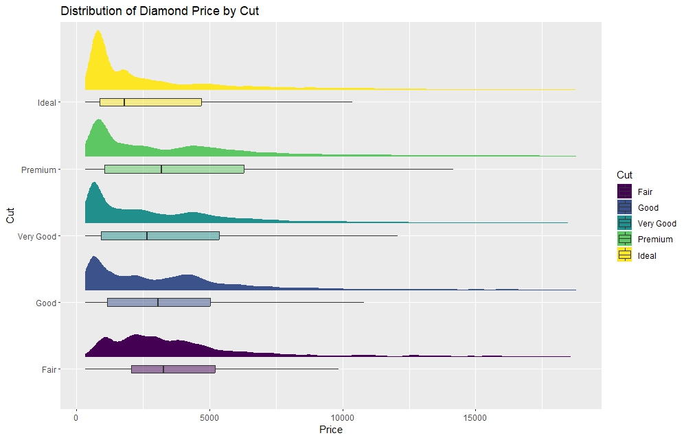
However, when you have a larger dataset, some of the same code can be used to produce just the density curves and box plots.
In the following video I demonstrate how to produce each of these graphs, talking through the various pieces of code (which is all provided below).
Subscribe below to get updates on my latest videos, courses, and other useful information.
library(tidyverse)
library(ggdist)
library(ggthemes)

# small dataset example

iris %>%
  ggplot(aes(x = factor(Species), y = Petal.Length, fill = factor(Species))) +
# add half-violin from {ggdist} package
  stat_halfeye(
    # adjust bandwidth
    adjust = 0.5,
    # move to the right
    justification = -0.2,
    # remove the slab interval
    .width = 0,
    point_colour = NA) +

# boxplot
    geom_boxplot(
    width = 0.12,
    # purple outlier points
    outlier.color = "purple",
    alpha = 0.5) +

# dots
    stat_dots(dotsize=0.5,
    # ploting on left side
    side = "left",
    # adjusting position
    justification = 1.1,
    # adjust grouping (binning) of observations
    binwidth = 0.1
  ) +

# Themes and Labels
  scale_fill_fivethirtyeight() +
  theme_fivethirtyeight() +
  labs(
    title = "Distribution of Iris Petal Length by Species (Raincloud Plot)",
    fill = "Species"
  ) +

# Horizontal to vertical
coord_flip()


## ------------------------------------
# Large dataset, exclude dots

diamonds %>%
  ggplot(aes(x = factor(cut), y = price, fill = factor(cut))) +
  # add half-violin from {ggdist} package
  stat_halfeye(
    # adjust bandwidth
    adjust = 0.5,
    # move to the right
    justification = -0.2,
    # remove the slab interval
    .width = 0,
    point_colour = NA) +

  # boxplot
  geom_boxplot(
    width = 0.12,
    # exclude outlier points
    outlier.color = NA,
    alpha = 0.5) +

  # Labels
  labs(
    title = "Distribution of Diamond Prices by Cut",
    x = "Cut",
    y = "Price",
    fill = "Cut"
  ) +

  # Horizontal to vertical
  coord_flip()